 |
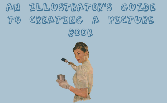
So you're an illustrator, trained in the fine art of interpreting text into one dynamic eye-catching illustration, one that says–– read this text! Perhaps then, you've thought about illustrating a kids' book. Perhaps you've even thought about writing one! Well, look no further. This article will cover the beginner basics and get you one step further into an editor's office. word count Okay, so let's assume that you've already created the text for your book-to-be––it's sad, it's funny, it rolls right off the tongue, and it has just the right amount of words for your target audience. Or does it? First consider this: As much as you'd like to write the next Velveteen Rabbit or perhaps tell the true life story of Ella Fitzgerald, remember that a longer text means an older audience. Who do you want to be reading your book? A toddler?A kindergartner? Or a kid who's going into the third grade? There are picture books for the older audience, but from my bookseller experience, most kids who are 7 and up are reading chapter books and novels––the next Junie B. Jones or for the more advanced, delving into the next Harry Potter. Shoppers are generally looking to buy picture books for the younger group. Most three year olds cannot sit through a picture book that consists of 3,000 plus words! So try to keep your story under 1,000 words and edit, edit, edit!
before you illustrate Now you have the perfect text and it's just right for your target audience. Now what? Well, you're an illustrator, right? So I'm sure you want to get illustrating! But wait just a minute. Are you sure you know HOW to illustrate a picture book? Do you know how many pages to make it? Do you know where to place the text? You're not thinking of illustrating the whole book in full color before you submit, are you? First things first... research! Go to your local library. Look at all the books. What catches your eye? What doesn't? Go to the bookstore. What's on display? What isn't? Go to a local story time. See what books are read. What age kids are listening? Are they paying attention? What books do they respond best to? Once you've discovered some of your favorites, take them home, look at them... study them! Who published what? How many pages do the books have? How many words? Go to Amazon.com or BN.com and read some picture book reviews. What have the reviewers said about these books? Any criticisms? Anything they like? What has the buying public said about them? (do keep this in mind that it's rare to find a book that doesn't get any criticism... they all do! So don't concentrate too heavily on what you think someone would say about your creation-to-be. But it never hurts to see what's hot and what's not, so to speak.) brainstorming So you've found books that you like–– books that resemble your own AND you know what publishing company has published what. The first thing to do is look at the layouts. How many pages do most of the books have? Many books are 32 pages. Some are 40 On occasion you'll see a 48 page book or one that's even 55 pages. Keep in mind that the more pages a book has, the more expensive it is to make. It's best to keep yours at 32 pages or 40 if you need the extra room. Picture books are in increments of 8 because of the way the paper is cut from the printed sheets. The longer books are usually longer for a reason. Most often they're nonfiction,with sometimes extra data in the back. Look at: SO YOU WANT TO BE PRESIDENT, FIREBOAT, to name a few. Also, many of the longer books are created by known authors or celebrities. There is a reason for this. To create such an expensive book, the publishing co. needs to be guaranteed its return. The print run on these longer books will most definitely be bigger. Madonna's book THE ENGLISH ROSES, for example, far exceeds the normal picture book page count...but her star status guarantees BIG sales. pacing Think about how you'd like the text to be broken up. It's very important in a picture book to have a good rhythm, pace, and contain the drama of the page turn. You don't want too much text on one page and none on the next, unless there's a good reason. WHERE THE WILD THINGS ARE is a great example of a book that uses excellent pacing––having words on some pages but on others––the wild rumpus begins–– there are none at all. sketches Many new illustrators wonder just how detailed their sketches should be. Do they have to be exact B&W replicas of the final product? No. Some illustrators do very detailed, neat sketches while others do not. Work in a way that's best for you. DO make sure, however, that your sketches clearly convey the characters, action, and setting. They can't be so rough that the editor and art director don't know what's going on. It's best to make sure that the action (characters running, cars zooming and so on) goes from left to right, encouraging the reader to turn the page. This is not a rule but it's good to do so whenever possible. Don't get too attached to your sketches because once you have a contract, some of them (or most!) will have to be changed. The text will be tweaked or completely rewritten and as a result, the sketches may also need to be redone. Creating a book is a collaborative effort and is much like a being part of a critique group. The art director may want you to make one of your characters running, while in your sketch, they are jumping. Or the editor may find that the picture and the text don't quite gel, so you may have to rework something...it's all part of the process. page layout There are different ways illustrators design their pages. Some do full page bleeds––with the illustration going to the edge of every page. Others choose to put their illustrations on the right page and the text on the left––the left side without an illustration. Another option is to use borders. Illustrators such as Chris Van Allsburg use them frequently. Some illustrators like to break through the borders by placing choice elements of their illustration, outside them. Look at THE FROG PRINCE CONTINUED, for example––an older book written by Jon Scieszka and illustrated by Steve Johnson.... Definitely worth a look. You can also mix it up, using full bleeds on some pages while using spot illustrations on others (spot illustrations are small circles or ovals with the image contained) the dreadful gutter While creating your sketches, even the rough thumbnails, it's best to keep the gutter in mind. Try drawing a line through the center of every sketch you do. This will help remind you to keep important things out of that gutter! Never put small faces in the center, hands, or anything with detail. Keep the text a good inch away. text placement It's good even in the thumbnails, to think about where you'd like the text to go. Again, keep the text away from the gutter. Do you want the text page to be white? Or would you like it to be placed on top of your illustration––a full page bleed? If you'd like to do the bleed, it's also important to leave a good solid space for the text, uninterrupted, without too many contrasting colors. Try not to put busy patterns or objects behind where the text will go. Do some illustrators do that? Yes. However, oftentimes those areas are airbrushed out so that the text is clearly legible. For all intents and purposes, that's not a look to strive for. the cover The cover is the first thing a shopper will see. You will need to make it eye catching, bold, unique,and something that will invite the shopper to view the inside. Look at covers of picture books. What's on the front of most of them? It's best to include your main characters on the cover, or at least capture the essence of your story. If your story is about trucks, put trucks on the cover. If it's about a snake that eats too much, put an overstuffed snake on the cover. Although you will not be designing the type yourself, it doesn't hurt to think about what you might want it to look like. A designer and the art director will come up with the font for your book, but it never hurts to give them a few suggestions! Of course, don't be surprised if they don't use your ideas. endpapers The endpapers consist of four pages––two in the front and two in the back. One side of each endpaper is attached to the cover boards. The next thing to consider is whether you want to illustrate your own pattern or picture. If you'd like to create an illustration for the endpapers, then these pages will be counted as part of your book––3 for the front and 3 for the back. Why 3 instead of 2? That's because the back side (the part that's glued down) will be counted. So if you're doing a 32 page book, you will be left with 26 pages and the book will start on page 4. If you don't have room to illustrate your own endpapers, then your book will start on page 1 and in that case, a plain colored paper or one with a simple pattern will be picked later on, to be used for the endpapers. front matter: title page The title page is just that––where the title will be placed, accompanied by your name and the publishing company or imprint. The title page always comes first, after the endpapers. You can create a half title page or use two full pages to place the title. Look at the different approaches to the title page. Some have detailed illustrations while others are very simple and direct, with sometimes just the text. Some stories even begin on the title page, using an illustration to introduce the characters and/or action. A good example of that is CAR WASH.
front matter: cataloging in publication (cip), copyright, and dedication page This page contains all the information about your book and usually, your dedication will go there as well. Some books combine this page with the title page while others designate a separate spread. You can leave the page blank or you can choose to illustrate it. This is another opportunity to introduce your characters and/or setting. On occasion, you'll see this information in the back of the book, instead of the front. Another option, if you're really pressed for room, is to put this information on one of the endpapers (if you choose to illustrate them). I've seen this done on occasion, such as Simms Taback's THE HOUSE THAT JACK BUILT. That method, however, isn't ideal. book size Think about what scale and size would work best for your project. A rectangle? A square? Certain sizes cost more money to make, so that's why the standard 8 X 11 is most common. Don't worry about the technical aspects ––those things will be discussed after you get your contract. More likely than not, you'll be asked what size and scale is best for you and the publisher will try to accommodate your needs. the dummy Once you've completed your sketches for the book, it's time to make a dummy. There is no one right way to create the dummy. You can glue your text onto the sketches and then photocopy them, while blowing them up to the correct scale. Another approach is to scan in your sketches, place the type on using a design program, and then print them out. Never send actual sketches. Always submit copies. Although editors are careful, things do get lost! Once you have your sketches printed, you can cut them up and glue them together. Some people choose to actually bind their sketches together (sewing or gluing), much like an actual book, while others choose to spend less time. A timesaving approach is to send your sketches in unbound. (Author note: I personally don't like to spend much time putting my dummies together. I scan them into my computer, place the text on using a design program, and then print the sketches out on regular 8.5 X 11 computer paper. I send my editors the sketches unbound. It's easier for them that way to make copies to bring to the editorial meetings). The thing to remember is that your dummy does not have to be "actual size." Sometimes it's easier to make a dummy that will fit neatly into an 8.5 X 11 envelope. Of course, if you envision your book BIG then perhaps it's best to show your scale ideas early on. For more information on how to create a book dummy, check out this informative article at www.yellapalooza.com
what to submit? When submitting your picture book idea to an editor, include: * A cover letter that lists the title of your project. Be sure to indicate whether you will be sending it elsewhere (as a simultaneous submission). * The manuscript and the book dummy. Some editors may go right to the dummy, but it never hurts to also include the text typed up. * Two finished illustrations. Although the dummy is in B&W and often very rough, it's important to show the editor what your finished product will look like. This is your chance to shine! Remember to include your contact information on your sample illustrations, as they may be filed for later reference. NEVER send original artwork. Either make a high quality color copy or even better, send a photo quality printout. * A self addressed stamped envelope. You'll find that some editors send back letters in your addressed envelope and some don't. Regardless, it never hurts to make their job easier. * Do keep track of submissions: Where you sent what and to whom*
One final note: Writing a picture book and getting it published takes dedication and hard work, but attempting to write AND illustrate a picture book is an extra challenge. There are advantages and disadvantages to the writer/illustrator approach. The first disadvantage is that you're giving the editor not one but two excuses to reject your work. Your writing ability and illustration talent must be equal. You cannot submit a great story with mediocre illustrations in the hopes that the great text will carry the weight. The same goes for the reverse. The advantage to writing and illustrating your own book, as an illustrator, is that you might get snatched up sooner. You won't have to wait for years until an editor finds the right text for you to illustrate. As an artist, there's nothing better than being able to control the look of your own book. After all, you're illustrating your own text. If you don't want to illustrate the ball orange, as it says in the text, then you don't have to! Just take out the word "orange" and replace it. That's the beauty of illustrating your own text. |